


Football is no stranger to awful, poorly-designed, lazy, or simply crazy club badges, of course – one browse through some of the crests in Germany will show you how “minimalist” becomes “we really could have done better”. There’s actually no way to know Hamburg SV’s logo is indeed Hamburg SV’s logo, for example.
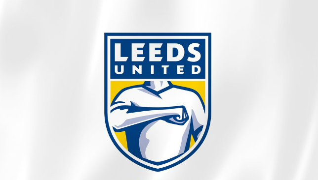
But the lack of imagination in some of Germany’s crests can perhaps be explained by some of the clubs that supposedly do put some thought into their design. Leeds, for example, claim they’ve spent half a year coming up with their new crest, and consulted more people than they can fit into the Don Revie Stand at Elland Road. You’d think they would have come up with something better after that.
Check out the gallery for a look at 10 of the worst crests in football. Which is the worst football club badge you know?6 months of research
10,000 people consulted
Ready for the next 100 years
Watch video ➡️ https://t.co/rIIdL2Yz9Fpic.twitter.com/pMrd3zTjCl — Leeds United (@LUFC) January 24, 2018
 1 / 10
 2 / 10
 3 / 10
 4 / 10
 5 / 10
 6 / 10
 7 / 10
 8 / 10
 9 / 10
 10 / 10


